
A Salute to Helvetica
What makes Helvetica so iconic? Is it the sophisticated yet simplistic style? Is it the huge number of global brands that have adapted it into their brandmarks? Or is it because Helvetica is the only typeface with its own critically acclaimed documentary? One thing’s for sure, Helvetica is the most recognisable typeface in the world – from traffic signs to tattoos to an ironic perfume “The Scent of Nothing”.
It all started in 1957 when Swiss designer Max Miedinger re-imagined an old German typeface. It was post World War II Europe and design trends were changing – out with the old and in with the new. Stripping back decorative flourishes in favour of a clear, modern design was simply reflective of a forward looking era. Sixty years later and it has become synonymous with contemporary design, still a favourite amongst global brands like Jeep, Microsoft and Lufthansa.
And why do we love it so much? Well, it’s no shrinking violet. Simple, down to earth and direct, it always packs a punch. Choosing it was a no brainer for a project we took on recently with the Port of Waterford. Its bold, timeless and practical characteristics echo the environment of the port itself, working perfectly across at any scale or size.


Keep Reading

Adare Manor Farewell Video

If you’re coming up with a brand name, don’t...

A new competitor to Slack
The Joke’s On Us
All Things Waterford

Bowled Over With Aldi’s Breakthrough Concept

A Celebration of Irish Hospitality
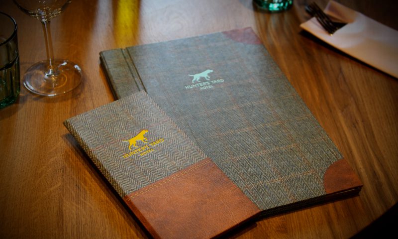
The Hunt Is On!

AIM Awards Important for Future of Marketing In Ireland

Blooming Into Great Relationships

You Say Potato…
Drover Foods

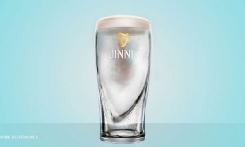
Judging A Beer By Its Cover

Glenisk #SweetBaby Search

Clontarf Castle – No Longer Dublin’s Best-Kept...

Slane Irish Whiskey

Breakfast of Champions

Brands Tackle Hurricane Harvey

Changing The World One Battery At A Time
