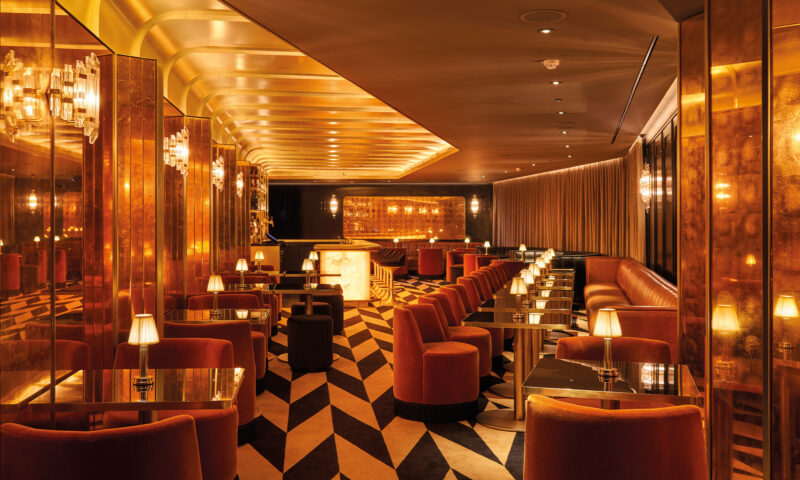
The Hamilton Princess

The mission
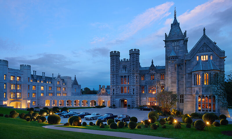
Nicknamed “The Pink Palace” for its iconic facade, The Hamilton Princess is an unmissable Bermuda landmark and luxury hotel: a beacon for generations of glamorous travellers since 1885. In 2016, The Hamilton Princess invested $100 million in a renovation that restored the hotel to its original glory while upgrading every aspect of their offering to the highest modern standards.
That’s when they started talking to Neworld, to see if we could help with the next step in their relaunch. The resort’s original website was showing its age so they came to us for a complete website redevelopment project.
The Hamilton Princess needed a site that would pull more traffic and generate more direct sales by appealing to a range of target audience categories with different interests and needs. That’s a balancing act for any business, but our deep experience of both website development and the luxury hospitality industry made this a perfect match for the Neworld Digital Team.

The question
What does luxury look like online?
Capturing the luxury travel experience digitally can be a challenge. Aesthetics are a large piece of the puzzle: you need to press the “luxury” levers and signifiers on a visual level. Elite design and photography are essential. It’s got to look incredible, or users will bounce at first sight. Then there’s the content, language and tone of voice.
But if we had to choose just one aspect of the luxury experience to recreate on your website, it’s ease. That’s a big part of what you’re paying for when you splash out on a high-end experience. It’s the whole appeal of concierge-level anything. How can you create a website with concierge-level? You can renew your commitment to making it easy for your ideal customers to get what they want.

The process
After our pre-production research we had a clear brief and some promising potential directions for the new site’s visual interface.
Once we’d explored the options and picked the strongest contenders, we produced a curated selection of initial design concepts for review. Once a client agrees a direction, we get to dive into the design development phase, where we create a final set of visuals and internal pages. Then it’s time to roll up our sleeves and get building.
Throughout the site, we placed special emphasis on usability and user experience, with the luxury of ease as our guiding principle.


The transformation
The new website we produced for Hamilton Princess was fully responsive, mobile-friendly and optimised for both SEO and organic search. The design was luxurious and refined, capturing the essence of the resort: sophistication, glamour and warmth. The website also guides visitors through a journey that spans the entire customer lifecycle, from intrigue and planning to pre-visit anticipation. Navigation was made simpler, with a clear call-to-action that drives on-site reservations.
Since that initial project, Neworld and Hamilton Princess have gone on to a long and fruitful working relationship. We continually renew and refresh the site design with ongoing maintenance, regular updates, and new features. The work may change over the years, but the goal remains the same: to ensure their online presence is always at its best, always ready to welcome new guests, and always showing the Hamilton Princess in all her glory.


