NUI Galway


The mission
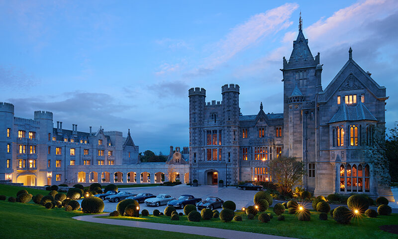
NUI Galway sits in the heart of bohemian, creative Galway city, on the wild Atlantic coast of Ireland. Founded in 1845, it has a rich history and cultural heritage of its own.
By 2018, when we met the team, the University were ready to attract more of the world’s best students and faculty to Galway, increase the engagement of their entire audience, and increase their global presence and reputation in terms of research, innovation and industry partnerships.
To meet these big goals, they needed two things. Firstly, a campaign to spark interest in the University before the approaching application deadline. Secondly, an updated design system that would unify the brand across all different departments and audiences.

The question
How do you unite a diverse, international university community into one clear identity?
The University were dealing with a lot of complexity on two planes: Their messaging needed to resonate with a very diverse set of people: students, alumni, parents, recruitment officers and the staff itself. The dynamics of the University were equally diverse, with a huge range of stakeholders across departments and the students, staff, and faculty siloed and spread across a large campus footprint.
The true intricacy of the task ahead of us became clear. If you’ve grown large enough for long enough, your identity can begin to sprawl and lose its crisp edges and clear focus. It’s an issue, but it’s solvable. It’s what we’re best at.
Because of our experience working with large organisations, we understood immediately that this would be as much a change management project as a branding project.


The process
We began with qualitative research conducted with a wide range of key stakeholders, followed by an ideation workshop to identify the University’s brand essence through potential key Communication Platforms. We then moved on to audience testing through focus groups before we finalised their brand and positioning strategy.
Our goal was to make the whole process as simple and engaging as we could, so that they’d feel empowered to share how they saw NUI Galway. We used a series of strategic exercises to encourage creativity, debate and generate a buzz and energy in the group.
We began building the new NUI Galway brand positioning, interpreting and bringing it to life with a campaign that resonated deeply with everyone: “Here is Where”. We then used our existing knowledge of the intricate dynamic within the University to create a flexible design system to cater to all departments.

The transformation
“Here is Where” captured the true essence of NUI Galway – the pride, spirit, energy, creativity and that deep grá that people feel for it. The campaign identity, bold typography, colours and angles were all chosen to encourage a more youthful and contemporary visual aesthetic.
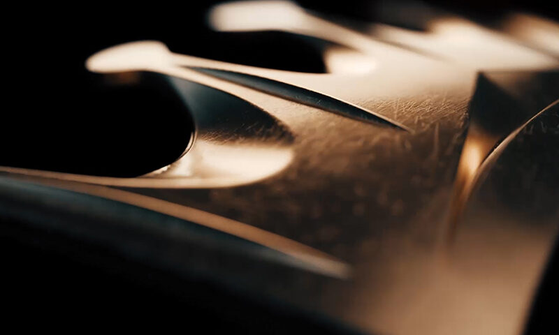
The design system was inspired by the shapes of the NUI Galway Logo and was flexible enough to be used across all areas of University and implemented easily by any partners and creative agencies.
Once the brand essence and visual identity was ready, we kept the change management process rolling with a Staff Induction Workshop. We brought everyone together to show them where we had arrived at so they could all feel invested in, and very much part of the process.
All of this strategy and design work hugely affected the University’s admissions, but we’ll let numbers speak for themselves…


