The Shelbourne Hotel
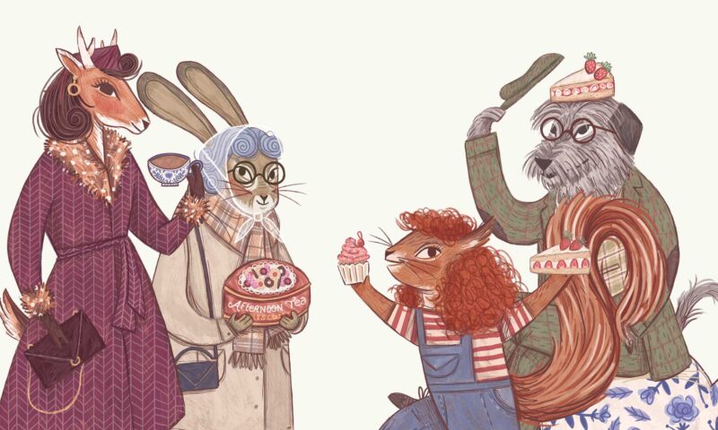
Artist: Hetty Lawlor
Illustrator: Alan Dunne
Animator: Jonathan Parson


The mission
The Shelbourne is a Dublin institution. It has played host to generations of the good and the great and watched some of Ireland’s most famous historical events unfold on its doorstep. The hotel is very grand and also lots of fun, with stories on top of stories and a long, long memory.
It’s not easy to sort through that much history and come up with a clear and compelling brand for a modern five star property. As the team prepared for a new chapter in The Shelbourne’s story, they called us to partner on a rebranding and design project with many moving parts.


The question
When you’ve been an icon for almost two centuries, how do you stay fresh?
The Shelbourne is a sparkling, cosmopolitan hotel, but the existing brand didn’t really communicate it effectively. The Shelbourne itself has always had a vibrant character and a diverse international clientele, but the branding needed a refreshed modern uplift.
The Shelbourne’s new brand strategy had to define its personality and independent spirit while honouring its rich and fascinating history. It needed to highlight its modern approach to luxury, establish a strong sense of place, appeal to both international and local clientele and stand out in a competitive local F&B and events market.
A big ask alright, but also right within Neworld’s wheelhouse.


The process
Our first order of business was to find The Shelbourne’s unique DNA that would inform every creative decision we made. Because The Shelbourne is so rooted in Irish (specifically Dublin) culture, we knew we needed to speak directly to the people who cherished this inimitable Grande Dame. Before the design project even started, we conducted dozens of interviews with staff, guests and suppliers. We immersed ourselves in both the history and the day-to-day life of the hotel. We led workshops and held consultations and sifted through the stories, looking for patterns and pulling insights from the mass of data.


The transformation
As we zeroed in on strong brand pillars and strategy for the hotel, the design side of the brand refresh snapped into focus. We took a good hard look to see what we could improve. We brought back the mark’s classic charm and reinvigorated it with elegance, balance and detail. We pared everything back, and gave it a fresh new colour palette. The core identity of the visual brand retained the best of the past, seen through a contemporary lens.
From there, we moved into a season of meticulous and detailed design work, influencing every digital and physical design asset in the hotel. We wanted the significance and luxury of the brand to be something guests could touch and feel. It had an obvious presence in pieces such as menus, stationery and packaging, where we carefully selected a range of finishes, papers, foils and final touches to reflect the premium positioning. We also designed evocative mementoes of the hotel, including a unique bullet whiskey glass and a commemorative book, so that guests could hold and carry a piece of The Shelbourne back home with them.


This was a rebranding project that actually encompassed a family of closely-related but distinct brands. We were creating an identity for The Shelbourne itself, as a destination luxury hotel. But we also needed to brand each of its offerings as a destination in itself. The goal was to invite resident guests to stay on site so they can enjoy the full Shelbourne experience, and also to give locals a reason to visit over and over again. This meant bringing together a hand-picked team of artists, illustrators, photographers, and experts to capture and interpret the distinct and different facets of the hotel experience.

Each and every touchpoint was considered and designed to tell the layered and complex story of The Shelbourne. We pulled from significant moments in its history and wove them into the modern-day brand experience, so it became meaningful and relevant to every guest. This kind of resonance would not have been possible without the in-depth research and strategy work we invested in at the beginning of the project.
Over the course of two hundred years, a property like this develops many strata of identity and perception, both internally and externally. Every decade that passes leaves its mark. Every person who has crossed paths with this place has an idea about what it is and why it’s special. But somewhere in all of that, there’s a bright thread you can follow. It comes together slowly, with a lot of investigation and interpretation, but it is always there. And it always leads directly to the heart of a brand.


